Finally, Eggleston…
Some trips you plan a dozen times before you actually take them. This was one of those.
David Zwirner Gallery's exhibition of William Eggleston's final dye-transfer prints — The Last Dyes — had been up since January 15th. I'd been meaning to get down to New York for most of that time. But, as Shakespeare put it, the slings and arrows of outrageous fortune had other plans. Life kept intervening, the way it does. I pushed the trip back once, then again, and then again after that.
Finally, on Sunday, the 1st of March, I committed. Or thought I had. I was going to the exhibition the next day, Monday the 2nd. But no, real life stepped in one more time, and I found myself postponing again. But the show was going to close on March 7th, so I did what I should have done weeks earlier: I bought the train tickets. The trip was happening on Tuesday, March 3rd, full stop.
The night before, Monday the 2nd, I went online to double-check the gallery hours, and the website was showing the gallery closed for the entire week - what a disaster, what a SNAFU (situation normal, all fucked up)! My best guess was that it was a posting they'd put up in the aftermath of winter storm Hernando, the week before, at least that was my hope. Not ideal news when you've already bought your tickets. I decided to go anyway. I had my train fare, I had the city — worst case, I'd have a good walk and a decent lunch.
I walked from Penn Station over to West 19th Street, turned the corner, and the gallery was open.
I can't quite describe the feeling of relief that washed over me, followed quickly by something closer to genuine excitement. I'd been wanting to see this work for a long time. I am something of a William Eggleston fanboy.
For those who don't know, the dye-transfer process is a painstaking, entirely analog method of printing — more akin to offset printing than conventional darkroom work. The image is split into three separation negatives, each immersed in a different dye bath (cyan, magenta, yellow), and pressed onto fiber paper one by one. Kodak stopped making the materials in the early 1990s, and Eggleston and his longtime printing team quietly began stockpiling whatever they could find. When the last of the 16x20 paper was gone, they went to 20x30. When that ran out, they were left with 20x24. Enough, it turned out, for about fifty final prints. The prints in the exhibition were those prints. There is a great YouTube video on the making of the prints in this show:
https://www.youtube.com/watch?v=TDEogEt_NeQ&t=245s
Walking around the gallery, a few things struck me immediately.
First, based on what I could tell, not everything was shot on Kodachrome. You could tell by looking closely at the grain — the structure and organization of it in some images was clearly from a color negative film rather than Kodachrome's distinctive fine grain. Contrary to popular belief, Eggleston shot on both Kodachrome and a variety of Kodak color negative stocks, and seeing the prints side by side made that difference visible in a way no book ever could.
Second, the depth of field. So many of these images were shot wide open, or close to it, with the main subject sitting right on the edge of focus — or sometimes just out of focus! When you think about the film stocks of the era (Kodachrome 25, Kodachrome 64, etc.), you understand why. At those ISOs, to get any kind of workable shutter speed handheld, you had to shoot with wider apertures. Whether that choice was always required by the physics of slow film or a necessary approach to handheld steadiness, or perhaps to offset the effects of his fondness for whisky, we will never know. It is there on the walls in a way you simply can't feel in reproduction; the shallow depth of field is so much more evident.
Then there is the color — wow, the color. Once again, there is no way a reproduction in a book will even come close to the vividness and depth of the colors in the prints in this exhibition. Now, the colors are not meant to represent reality. Eggleston loved the oversaturation and dream-like, some might say nightmarish, look that the dye-transfer process provides. The color was breathtaking, but not something I want for my images.
And that brings me to the biggest takeaway from this whole experience. Seeing Eggleston's images in a book — even a beautifully printed one — is one thing. Standing two feet from a 20x24 dye-transfer print is something else entirely. The tilted horizons, the objects cut off at the edges, the subjects that drift slightly out of focus — all of it reads differently at scale. In a book, those things are not always obvious, but on the wall, at that size, they are in your face. I was taken aback at first, was it sloppiness, slipshod, or purposed shooting. In the end, somehow, they feel like choices. And, I suspect many were!
I'm glad I finally went. I'm glad the gallery was open. And I'm a little grateful, honestly, that life kept getting in the way — because it meant I walked in there with ten weeks of anticipation behind me. Worth every bit of it.
I will always be an admirer of Eggleston’s work. I have enjoyed digging deep into his development as an artist. And, I will admit that, like many, I was dismissive of his work at a casual glance. It took quite a while and a great deal of research to attain an understanding of what his photography practice was about - “photographing democratically,” the idea that in “all subjects, regardless of their perceived importance, deserve equal photographic consideration, elevating the ordinary to the sublime.”
The source, the genesis of this style, is told and retold in many different ways, but the one I like best comes from the BBC doumentary: “William Eggleston: Imagine.” In it, his wife, Rosa Eggleston, shared this story of how Eggleston was inspired to first start photographing “ugly stuff”:
“Bill at one time said to his great, highly respected friend: Well, what am I going to photograph? Everything here is so ugly.’ And our friend said, ‘Photograph the ugly stuff.’ Well, we were surrounded everywhere by this plethora of shopping centers and ugly stuff. And that is really initially what he started photographing.”
If there is one thing from Eggleston’s work that I have attempted to incorporate into my photographic practice, it is not to look solely for the beautiful and the unusual, but to look at everything, even the “ugly,” as worthy of being photographed, and hopefully photographed well.
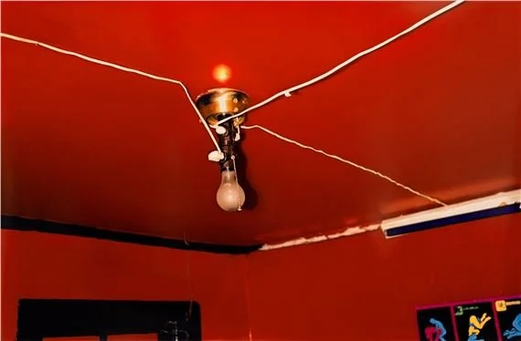
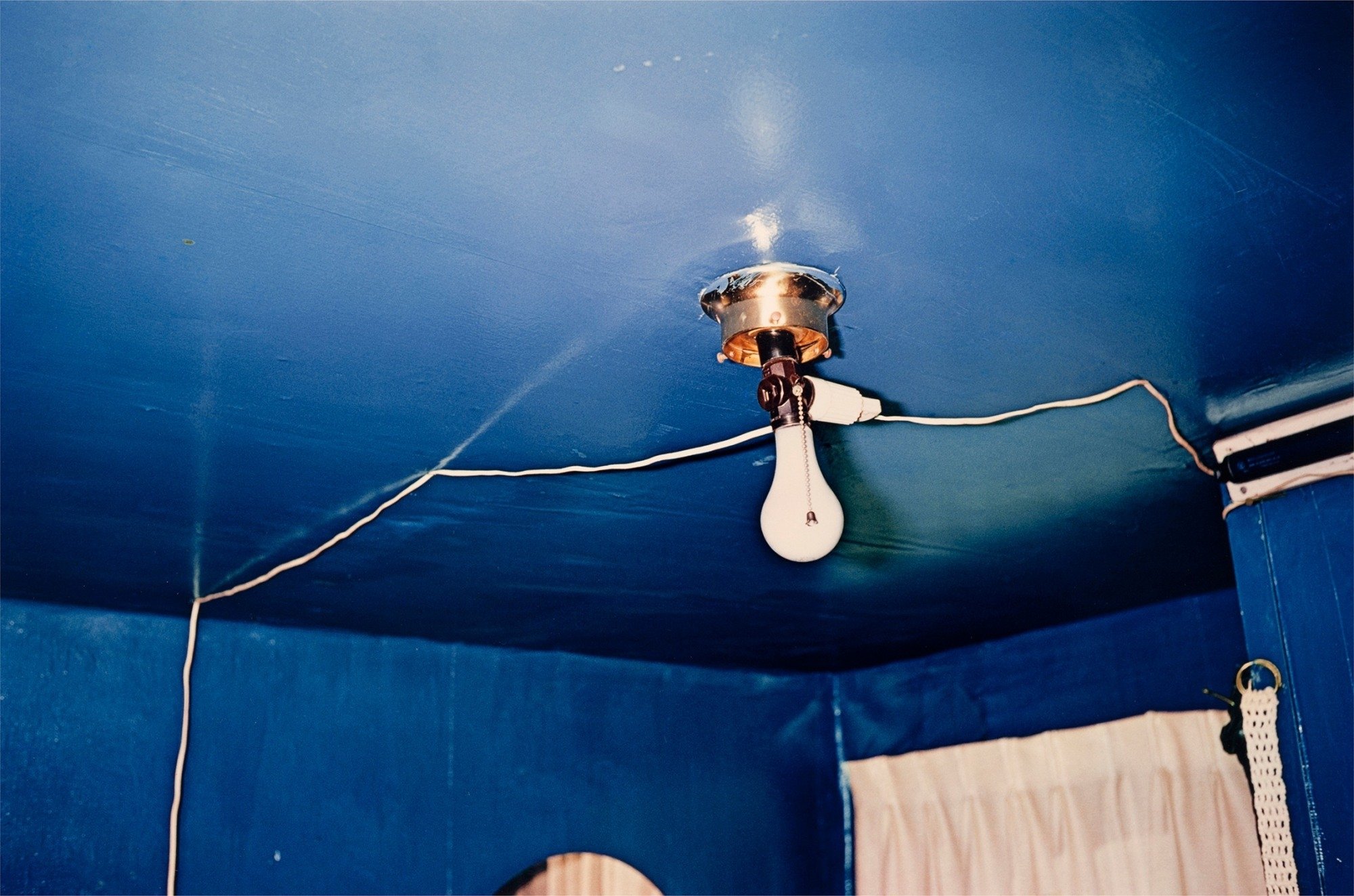
P.S. One of Eggleston's most well-known images is of a red ceiling - a very red ceiling. On the exhibition website and in the book published as part of the exhibition, there is an image of a very blue ceiling. My first reaction, and that of several other people I spoke with, was: WHAT! It just looked too similar; had they changed out the color somehow? What was going on? Well, with a little research, it turns out the image was made in the same house at the same time, in a different room, a blue room — so, there you go!